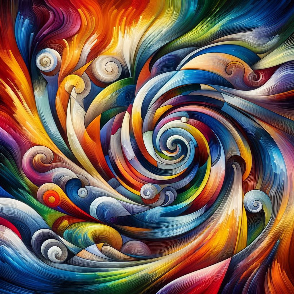

Color theory is a fundamental aspect of art that explores how colors interact, influence each other, and affect human perception and emotions. In abstract art, where a representation of real-world objects is minimal or absent, color becomes a primary vehicle for conveying emotions and setting moods. Artists utilize color theory principles to evoke specific emotional responses and create particular atmospheres within their works.
Understanding Color Theory
Color theory involves the study of how colors mix, the visual effects of color combinations, and the impact of specific color choices on human perception. The foundational element of color theory is the color wheel, which organizes colors in a circular arrangement to illustrate relationships between primary, secondary, and tertiary colors. This tool aids artists in understanding how to combine colors harmoniously or contrast them effectively to achieve desired visual effects.
Emotional Associations of Colors
Colors are often linked with specific emotions due to cultural, psychological, and physiological associations:
- Red: Often associated with passion, energy, and intensity. It can evoke feelings ranging from love to anger.
- Blue: Typically linked to calmness, serenity, and stability. However, it can also convey sadness or melancholy.
- Yellow: Associated with happiness, optimism, and warmth. It can also suggest caution or anxiety in certain contexts.
- Green: Symbolizes nature, growth, and tranquility. It can also represent envy or inexperience.
- Purple: Conveys luxury, creativity, and spirituality. Historically, it has been associated with royalty and nobility.
- Black: Often linked to sophistication, mystery, or mourning. It can evoke a sense of elegance or foreboding.
- White: Represents purity, simplicity, and cleanliness. It can also suggest emptiness or coldness.
Application in Abstract Art
In abstract art, where traditional forms and subjects are absent, color takes on a dominant role in conveying meaning and emotion. Artists manipulate color to create specific moods and elicit particular responses from viewers:
- Color Harmony and Contrast: By placing certain colors next to each other, artists can create harmony or tension. Harmonious color schemes, such as analogous colors (colors next to each other on the color wheel), can produce a calming effect. In contrast, complementary colors (colors opposite each other on the color wheel) can create visual tension and excitement.
- Saturation and Brightness: The intensity and brightness of colors can influence the viewer’s emotional response. Highly saturated, bright colors can convey energy and vitality, while muted, subdued colors can evoke feelings of melancholy or calmness.
- Warm and Cool Colors: Warm colors (reds, oranges, yellows) are often associated with warmth and energy, while cool colors (blues, greens, purples) are linked to calmness and serenity. An artist’s choice between warm and cool colors can significantly impact the overall mood of the artwork.
Historical Perspectives
The relationship between color and emotion has been explored by artists and theorists for centuries. For instance, Georges Seurat, a pioneer of the Pointillist technique, was influenced by contemporary color theories. He believed that colors could be used systematically to evoke specific emotions and created his artworks by placing tiny dots of pure color next to each other, allowing the viewer’s eye to blend them and perceive a fuller range of tones.
Conclusion
Color theory serves as a vital framework for artists, particularly in abstract art, to convey emotions and set moods. By understanding the psychological and cultural associations of colors, artists can intentionally select and combine hues to elicit specific responses from viewers, making color a powerful tool in creating evocative and meaningful art.