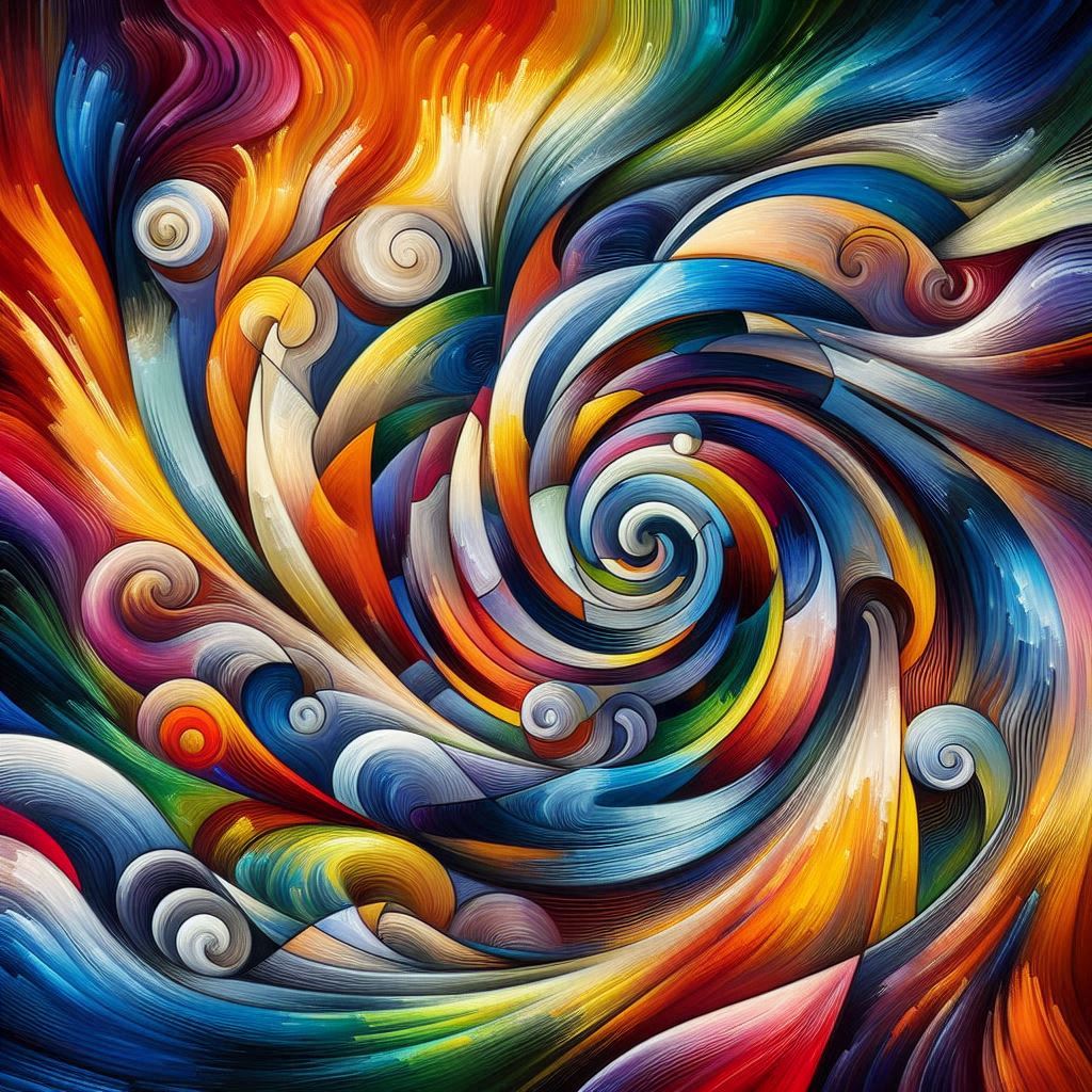
Colors are like silent songs, playing a melody that speaks to our emotions. Each color has its psychological impact that connects with viewers in unique ways. Ever noticed how being surrounded by blue makes you feel calm, while red can spark excitement or even a bit of tension? That’s because colors speak directly to our feelings before our brains even have time to process them.
And hey, color symbolism can mean different things in different cultures. For instance, white is often seen as a symbol of purity in Western cultures, but in some Asian societies, it’s associated with mourning. Knowing these differences is key when creating art meant to connect on a universal level because you want your message to be clear to a wide audience.
Abstract art often uses these colorful tools to evoke emotions and set moods without needing words. It’s fascinating how a splash of color can transform a piece from joyous to melancholic. A simple switch from bright yellows to deep blacks can flip the entire vibe of the artwork.
Remember, interpretation isn’t just about the artist’s intentions. Personal perception plays a huge role too. Our past experiences and cultural backgrounds influence how we perceive art. So when you look at a piece, it’s kind of like everyone sees their version of reality through the colors presented.
So what’s the key takeaway for artists? Choose your colors wisely—they’re your words in the silent world of art. Want to convey happiness? Go for some yellows and oranges. Seeking tranquility? You might want to splash some greens and blues on your canvas. The aim is to use colors that authentically tell your emotional story.
The Artist’s Brush: Crafting Emotional Narratives through Color
Abstract artists are like storytellers, and their medium is a vibrant palette that speaks louder than words. Think of artists like Wassily Kandinsky, who believed that color could evoke sound—literally “painting music.” His abstract work demonstrates how artists can create entire symphonies of emotion with just brushes and paint.
Take a look at other abstract greats like Mark Rothko or Piet Mondrian. Rothko’s bold blocks of color-drenched emotion are a prime example of using simple colors to spark complex feelings. Meanwhile, Mondrian’s vibrant primary colors speak to order and harmony amidst chaos. These artists illustrate how color choice can direct the viewer’s emotional journey through a piece.
Delving into specific artworks reveals the power of color in the art world. It’s fascinating to examine a painting like Rothko’s “Untitled, 1952″—notice how its deep reds and blacks create tension and depth. The emotions run deep, proving how strategic hues can carry heavy emotional weight.
Artists don’t just happen upon these perfect combinations, though. It’s all about balancing color and form to convey the desired message. Striking just the right balance invites viewers into a world where they can engage on an emotional level, immersing themselves fully in the experience.
For folks looking to harness this language of color in their art, it’s all about practice and intuition. Don’t be afraid to experiment. Try mixing unconventional colors or placing unexpected shades next to each other. The goal is to create a canvas that echoes your inner feelings, letting others in on your creative world. Unleashing your personal experiences through careful color choice can transform even the simplest abstract work into a profound narrative.
Connecting with the Audience: The Universal Language of Colors
Colors in abstract art aren’t just about the artist expressing—it’s also about building a bridge between the artwork and its audience. Every color choice contributes to a visual dialogue, striking chords with viewers even without uttering a single word. Imagine stepping into a gallery and instantly feeling uplifted or introspective because a painting’s colors spoke to you.
That’s the magic of colors. They carve out an emotional connection and set a specific atmosphere, making each viewer’s experience personal and unique. A painting that makes one person feel joyful might evoke a sense of nostalgia in someone else. It’s this dynamic connection that makes abstract art such a compelling universal language.
Art galleries and museums know this all too well. Lighting, placement, and color focus are all about enhancing viewer interactions. By spotlighting an artwork’s color dynamics, curators can steer the collective experience while still leaving space for personal interpretation. Imagine walking through an exhibit bathed in soft lights that accentuate the cooler tones of a piece, encouraging a serene reflection.
Artists should think of their work as starting a conversation with the audience. Your goal isn’t just to present a piece—it’s to curate an experience. Consider how your color choices affect the viewer’s mood. Would they feel welcomed or introspective? Play around with dark shades or vibrant hues to guide them through your visual narrative.
In our digital age, adapting these techniques to contemporary formats is crucial. Digital art opens up endless possibilities for color manipulation, but the core remains the same: will the piece invite a connection? Next time you’re working on an art piece, think about how it might look on different screens or devices. The world is your canvas, and your color choices are the keys to forging meaningful connections on both a local and global scale.

